Optimize your calendar for mobile
Your events calendar has to look good and work well for two types of site visitors, those using computers and those using mobile phones and tablets. A single calendar view won't satisfy both types. That's why we created the Mobile Table calendar view.
This topic describes how to coordinate the 25Live® mobile options with steps you've already taken to make your website mobile-friendly.
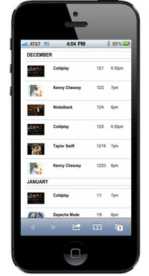
Viewing a calendar customized to look good on mobile devices.
Topic links
- Mobile options: An overview
- Important information about Mobile Table view
- Preview the Mobile Table view
- Edit the Mobile Table view settings
- Tips on grouping
- Event details and the Mobile Table view
- Control spuds and mobile views
- Auto display mobile views on mobile devices
- Set a maximum width for images when spuds are displayed at less than a specified width
- Publish your events in a mobile app
Mobile options: An overview
The following table matches the mobile-friendly steps you've already taken with the steps you need to take in 25Live to optimize your calendars for a mobile experience.
| Mobile steps you've taken | What to do in 25Live |
| None |
|
| Separate mobile website |
|
| Mobile-responsive website
By mobile-responsive, we mean your website automatically detects either the device or the screen size of the device a website visitor is using. |
|
| Offer mobile apps for download |
|
Important information about Mobile Table view
To get the most out of the Mobile Table view spud, take a few minutes to familiarize yourself with some important background information.
- You don't have to create a separate mobile publication. Each published calendar has its own Mobile Table view spud that you can customize and embed on your mobile website.
However, there are some publication-level settings that affect both the main and mobile views. If you want the finest level of control over how your mobile calendar and its event detail pages look and behave, you may want to create a separate mobile publication.
- While there is only one mobile calendar view, this view is based on best practices from existing mobile-optimized 25Live calendars. For example, we've found that a table layout works best for smaller mobile screens.
Mobile Table view is similar to the Classic Table main calendar view except that the mobile view's default settings focus on keeping the calendar width small. For example, by default, Mobile Table view shows only each event's start time, start date, and description, hides some event and calendar actions, and uses the small versions of paging buttons.
- Some but not all settings choices you make for the main calendar spud affect the Mobile Table view. For example:
- Embedded Calendar List If you display the calendar list for the main calendar spud, you also display it for the Mobile Table view.
- Search Status Panel If you display the search status panel for the main calendar spud, you also display it for the Mobile Table view.
- Event Actions Panel For Mobile Table view, event actions are turned off by default. However, if you turn them on for the mobile view, then main calendar spud style settings affect the event actions panel for the Mobile Table view.
- Calendar actions panel Main calendar spud calendar actions settings do not affect Mobile Table view. The mobile view has its own calendar actions panel settings.
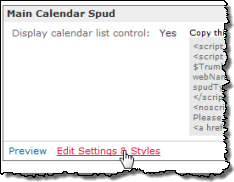
Tip To modify settings for the main calendar spud, in the Publishing Control Panel, click the Calendar Spuds tab. In the Main Calendar Spud section, click Edit Settings & Styles.
- The default settings for Mobile Table view reflect best practices we've observed from mobile-optimized 25Live calendars that have already been published.
For example, to save space and keep the mobile calendar simple, we've limited the fields that display with each event and the number of events that display per page. We've also turned off some event and calendar actions in the calendar view.
- Just like other spuds, the Mobile Table view spud picks up your base style color and font settings. You can override the base settings if you want.
- The mobile table calendar view has it's own independent event detail view. Learn more here.
- If you embed a View Chooser control spud on your calendar page, Mobile Table view is not included in the list of selectable views.
Preview Mobile Table view
You have two options for previewing the Mobile Table view. The option you choose depends upon your current goal.
- If you want to get a sense for the mobile view's default settings before you do any customization:
Use the view's Preview feature on the Calendar Spuds tab.
- If you have previewed and, optionally, customized the mobile view and enabled the Enable mobile calendar view option:
On a mobile device, navigate to the URL for the calendar's hosted view.
Tip The following steps assume that you have already created, added events to, and published at least one calendar.
Preview the Mobile Table view's default settings
The Mobile Table view default settings may work perfectly for you. Or, you might want to modify the settings. You won't know unless you preview the defaults.
Tip Font and color style settings are taken directly from your publication's base style settings so they already reflect your organization's branding. Some mobile view settings are inherited from the main calendar spud. Learn more.
To preview the Mobile Table view settings
- In the Publishing Control Panel, select the Calendar Spuds tab.
If you're not in the Publishing Control Panel, in the 25Live editing environment, select the calendar you want a mobile view for, and then click Publish Settings.
- In the Mobile Main Calendar Spud section, under Mobile Calendar View, at the bottom left of the Mobile Table spud, click Edit Settings & Styles.
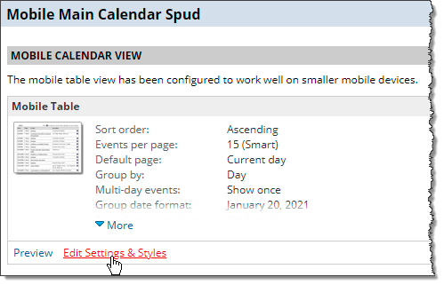
- Scroll to the bottom of the Edit Settings for Mobile Table View page, and then click Preview.
The Preview for Mobile Table page appears:
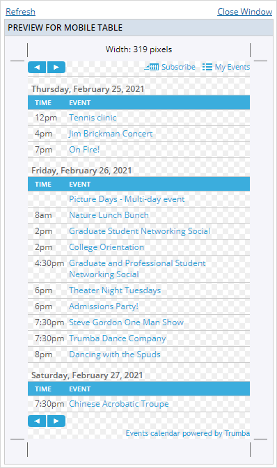
- If you're happy with the preview, you're ready to embed the spud in your mobile website or set the Enable mobile calendar view option.
To modify the the settings, see Edit the Mobile Table view settings.
Preview the hosted page using a mobile device
After you're satisfied with the Mobile Table view settings and you set the Enable mobile calendar view option, you can preview the view on a mobile device by navigating to the URL for the calendar's hosted view.
How do I find the URL for a calendar's hosted view?
On a mobile device, the hosted page preview will look something like this example that shows a Mobile Table view on an iPhone:
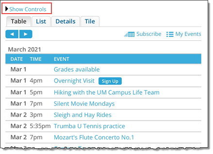
The Show Controls link above the calendar is unique to the hosted view and will not show up when visitors view the calendar embedded into your website. Clicking Show Controls displays the control spuds that typically appear to the left of the calendar in the hosted view.
Edit the Mobile Table view settings
Tip These steps assume that you have already created, added events to, and published at least one calendar.
- Follow the first two steps in the preview Mobile Table view section.
- On the Edit Settings for Mobile Table View page, you see three tabs: General Settings, Calendar Actions Panel, and Events: Default Layout.
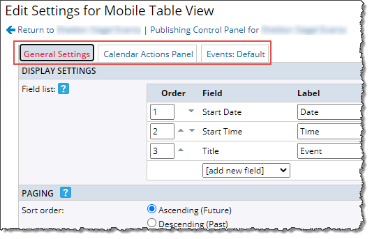
Tip If you decide to change default settings on one or more tabs, best practice is to preview after each couple of settings changes to see the specific effects of each change and to know which changes you want to undo.
- On the General Settings tab, change default settings related to the fields that display, how many events display and how they are grouped, what event actions and paging buttons are available, and the overall calendar style settings.
Event actions
By default, event actions are turned off in the mobile calendar view while they remain available in the detail view. Mobile visitors who view event details can still add events to their calendars, forward events to friends, and more.
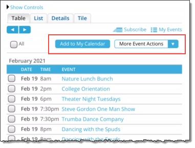
Note If you set the event actions display to Multiple, visitors can take event actions on more than one event at a time. Notice the mobile-responsive version of the Event Actions panel at the top of the calendar view:
Featured events
If you want to feature events in the mobile view (and you've set up featured events for the calendar), in the Event Layout section, assign layouts to the featured levels you have defined.
- On the Calendar Actions Panel tab, change default settings related to which calendar actions are available to mobile calendar visitors and the colors and fonts of the calendar action links.
- On the Events tab (or tabs, if you assigned featured event layouts), change default settings for how events display and look.
- At the bottom of the page, click Preview to preview the view one last time. When you're satisfied, click OK.
Tips on grouping
You can use the group by feature to enhance the display of your calendar.
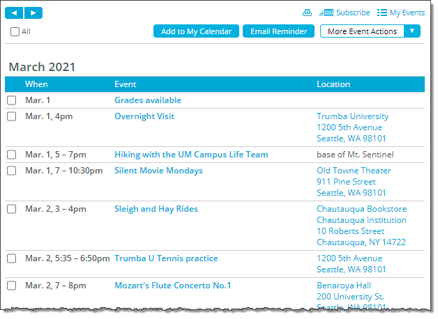
- To simplify the group by month display, you can use the Date/Time Span field to combine both the date and the time in one column. The default label for the column is When, as in this example:
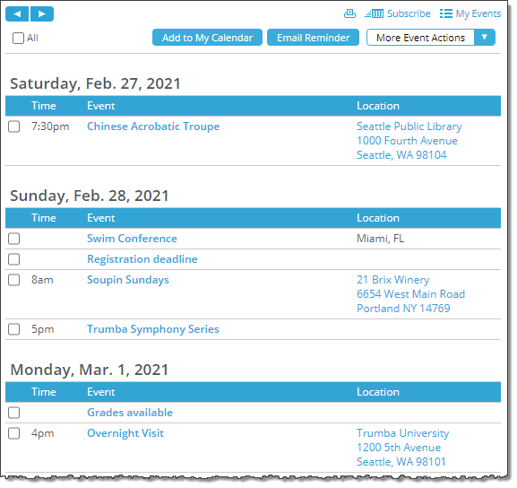
- If there are a lot of events each day, it can be hard to follow when grouping by month. Try grouping by day instead, and then remove the start date to provide a cleaner view, for example:
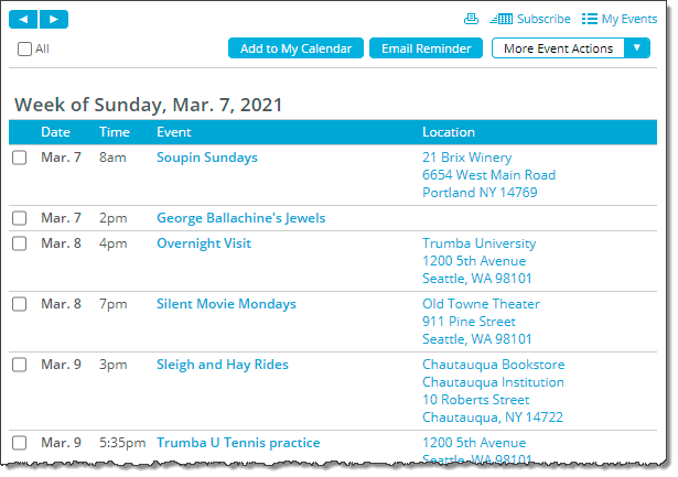
- Depending on the number of events, grouping by week could work best, but in this case, you'd need to keep the start date. For example:
Event details and Mobile Table view
The mobile calendar view has its own mobile event detail view. This gives you the freedom to customize the event detail view to look good and perform well in the limited space available on mobile devices.
Note You can set your main calendar view to automatically display the mobile calendar view and/or the mobile detail view, separately, on mobile devices. More
For example, your main calendar detail views might include large images and map thumbnails and the entire range of event actions. You can customize the mobile detail view to hide map and event images and show only the Facebook and Twitter event actions.
To learn more about customizing event detail views, see Event detail views.
Control spuds and mobile views
Refresh my memory about control spuds.
How control spuds look and work on mobile devices depends upon which mobile option you implement and the type of control spud you use.
- Control spuds with a separate mobile website
- Control spuds when the main calendar automatically detects mobile
- Mobile devices and the View Chooser spud
- Configure filter spuds to respond to the viewing device
Separate mobile website
If you have a separate mobile website, you may want to embed one or two control spuds above your mobile calendar spud. For example, filter, location search, and keyword search control spuds might work well in a mobile environment.
Tip If you want to use the same types of control spuds on your mobile site as you use on your main site but customize them differently, remember that you can create multiple configurations of the same spuds for use in different contexts.
Given the limited width available on mobile devices, it's probably best to position control spuds above rather than beside the calendar view.
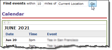
Location search spud positioned above the mobile table calendar view
Tip You can configure filter spuds to respond to the viewing device. Learn more.
Main calendar spud set to display the mobile calendar view
If you set your main calendar spud to display the mobile calendar view on mobile devices (Learn more), any control spuds you've embedded above or alongside the calendar also appear on mobile devices. For more information, go to Main calendar views.
If you've embedded keyword search, View Chooser, and audience filter spuds into the main calendar page, for example, these same control spuds display alongside the mobile table calendar view when users view the calendar using a mobile device.
While you can't hide control spuds on mobile devices, you can configure filter spuds to respond to the viewing device (Learn more).
Mobile devices and the View Chooser spud
If your main calendar automatically detects mobile and a View Chooser spud is embedded on your main calendar page, visitors who view the calendar on a mobile device will see the View Chooser.
Even when mobile table view isn't explicitly listed in the View Chooser, it is always automatically associated with the main calendar's default view when viewing the calendar on a mobile device.
For example, in this View Chooser, List is the main calendar's default view. When visitors first view your calendar page using a mobile device, they see the View Chooser with List view selected and the calendar in mobile table view.

If visitors switch to a different view, they can return to the mobile table view by selecting List again.
Important In this scenario, visitors who are viewing the calendar on a mobile device could potentially use it to switch to a different view that isn't mobile optimized. To avoid this issue, you can hide the View Chooser on mobile devices. See How to hide View Chooser on mobile devices.
Configure filter spuds to respond to the viewing device
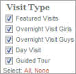
You can configure filter spuds to respond to the device on which they're being viewed. For example, you can set up a multi-select filter spud that automatically converts to a space-saving single-select spud when your webpage is viewed on a mobile phone or tablet.
| Multi-select filter | Single-select filter |
 |
 |
To make a filter spud device responsive, in the Publishing Control Panel, on the Control Spuds tab, edit the settings for the spud you want to configure and set the Force single select on mobile option to Yes.
I need more details about adding and configuring filter spuds.
Optimize the main calendar for display on mobile devices
You can set your main calendar view to automatically display the mobile calendar view and/or the mobile detail view, separately, on mobile devices. For example, a visitor using a:
- Computer sees the main calendar view and detail pages.
- Mobile phone or tablet sees the mobile calendar and/or mobile detail views.
We recommend that you preview the mobile calendar and/or event detail views before you select these settings. For more information, go to Main calendar views.
Tips
- Even if you have a mobile-responsive website, you must set the main calendar view to automatically display the mobile calendar view and/or the mobile detail view.
- With the main calendar spud set to display the mobile calendar view and/or the mobile detail view, the calendar responds to the device a viewer is using, not the specific size of the viewer's screen. Both mobile phone and tablet viewers see the same mobile-optimized calendar and/or event detail views.
- Event actions pages, which open when viewers subscribe to calendars or take event actions, such as adding events to their personal calendars, are responsive to browser window size. Learn more.
To display the mobile calendar view and/or mobile detail view on mobile devices:
- In the Publishing Control Panel, click the Calendar Spuds tab.
- Under Main Calendar Spud, click Edit Settings & Styles.
- On the General Settings tab, set Enable mobile calendar view and/or Enable mobile detail view to Yes.
- Click OK.
Preview the mobile calendar and/or event detail views using both a computer and a mobile device to confirm that the customized views look how you want. For more information, go to Main calendar views.
Tip You can preview the Mobile Table view on a mobile device by navigating to the URL for your hosted calendar. By default, the control spuds that appear to the left of the calendar on the hosted page are hidden. On your mobile device, you can display the control spuds by tapping Show Controls above the calendar. 
Set a maximum width for images when spuds are displayed at less than a specified width
For supported calendar view and promotion spuds, in addition to setting a maximum width for all event images:

... you can also set a maximum width for when the spud is displayed at less than a specified width, including when viewing the spud on a mobile device:

Supported calendar view spuds and where to find these settings:
| Calendar view | Settings locations |
|---|---|
| List, and Classic Table | Max image width control: Events tab > Image Settings section. Spud width less than and Max image width mobile controls: Events tab > Image Width Mobile section. |
| Detail List - Title, Detail List - Date, and Photo Events | Max image width control: Settings tab > Image Settings section. Spud width less than and Max image width mobile controls: Styles tab > Image Width Mobile section. |
Supported promotion spuds spuds and where to find these settings:
| Promotion spud | Settings locations |
|---|---|
| Event Slider, Upcoming Fader List, Upcoming Vertical Crawler, Photo Upcoming, and Upcoming Table | Max image width control: Settings tab > Image Options section. Spud width less than and Max image width mobile controls: Events tab > Image Width Mobile section. |
Publish your events in a mobile app
In addition to or instead of publishing an events calendar optimized for a mobile website, you can include your calendar in an app that your customers can download to their mobile devices.
To include calendar data in a mobile app, the app developer uses one of the data feeds that 25Live automatically generates for every calendar you publish. The feeds even break down the data, which gives the app developer enough flexibility to control which event fields display.
To provide the app developer with the feed URL
- Decide which custom fields you want to display in the mobile app calendar. For example, in addition to event title and description, you might want to display event type. Or, you might want featured events to reflect their customized formatting.
- Ask the app developer what kind of data feed (RSS, Atom XML, iCal, CSV, or JSON) will work with the app.
- In the 25Live editing environment, select the calendar with events you want to include in the mobile app.
- Click Publish Settings.
- In the Publishing Control Panel, click the Feeds tab.
- Copy the URL for the type of feed the app developer wants to use.
For example, if the developer will use:
This feed type Provide a URL similar to this iCal http://www.trumba.com/calendars/yourcalendarwebname.ics RSS http://www.trumba.com/calendars/yourcalendarwebname.rss?xcal=1 Atom (XML) http://www.trumba.com/calendars/yourcalendarwebname.xml?xcal=1 JSON http://www.trumba.com/calendars/yourcalendarwebname.json Tip Before giving the RSS or Atom feed URL to the developer, add the xcal parameter to the end of the feed exactly as shown in the table. This parameter makes all event fields accessible to the developer so you can choose which fields to display in the app. With iCal feeds, all fields are automatically accessible.
You or the app developer can learn more about calendar feeds at Customize calendar feeds.
