Main calendar views
Calendar views are ways of presenting events in a main calendar spud.
For example, some views provide a lot of detail with each event. Other views are spare and compact. Some views support photos. Others look very traditional, like something you might see hanging on your kitchen wall.
The following image shows the same events presented in Classic Table, List, and Tile view.
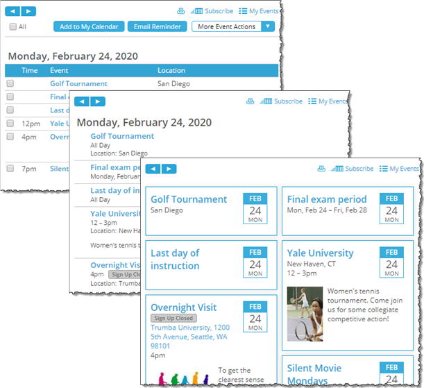
Three views of the same main calendar spud
While each main calendar spud has a default calendar view, you can associate the spud with several different views and give visitors the option of selecting the view they prefer. You can also customize each view to present events exactly the way you want.
How do I let visitors choose between calendar views?
Tip The main calendar spud not only displays the calendar views, it also displays event detail views that appear when you click an event title in the main calendar or other spud. For information about selecting and customizing event detail views, go to Event detail views.
Topic links
- Add, remove, and reorder calendar views
- Change the default calendar view
- Customize main calendar views
- Customize individual calendar views
Add, remove and reorder calendar views
Every published calendar has a default view that you select when you first publish the calendar.
With the main calendar spud, you aren't restricted to a single view. You can select alternate views, and then give calendar visitors the option to switch between views to find the one that best meets their needs.
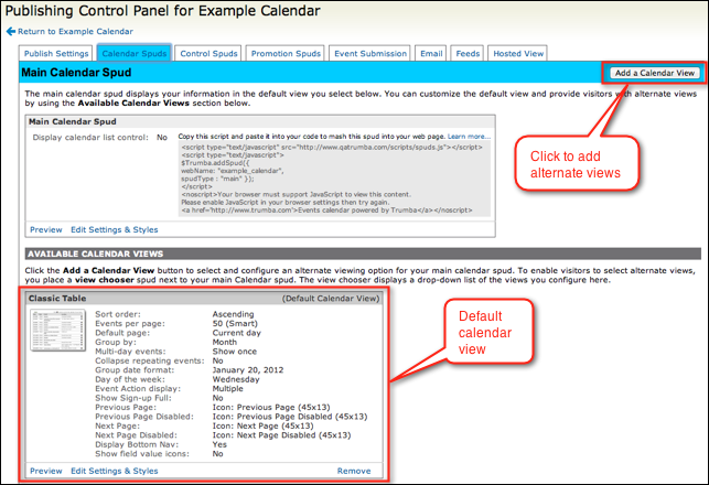
With the main calendar spud, you aren't restricted to just one calendar view.
Tips
- While you can add as many alternate views as you want, three to five view options satisfies the needs of most calendar visitors.
- To support view switching, place a View Chooser control spud on the page that contains the main calendar spud.
I'd like more information about control spuds in general and the View Chooser spud in particular.
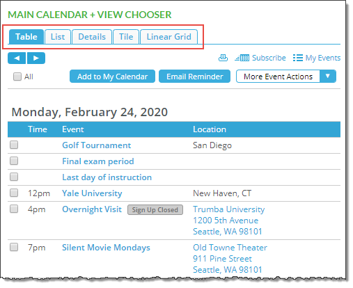
Calendar visitors use the View Chooser control spud to switch between views. The Tabbed view chooser above the main calendar is outlined in red. Your calendar's calendar and event options may look a little different than the ones shown here.
To add alternate views
- In the Publishing Control Panel, on the Calendar Spuds tab, in the Main Calendar Spud title bar, click Add a Calendar View.
- In the Add Calendar View page, select the view you want and click OK.
- In the Publishing Control Panel, you can now edit the view's styles and settings.
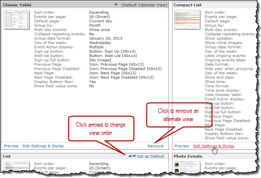
Click links at the bottom of calendar view descriptions to edit settings and more.
Tips
- You can remove alternate calendar views at any time. In the Publishing Control Panel, on the Calendar Spuds tab under Available Calendar Views, find the view you want to remove. In the bottom right corner of the view description, click Remove.
- To quickly change calendar view order, on the Calendar Spuds tab, find the view you want to move, and then click the up or down arrow located next to Set as Default in the upper right corner of the view box.
Change the default main calendar view
If you've added alternate views for a main calendar spud, you can change which view is the default at any time.
To change the default view
- In your 25Live account, display your calendar, and then click Publish Settings to open the Publishing Control Panel.
- On the Calendar Spuds tab, under Available Calendar Views, find the view you want to set as the default.
- Click Set as Default in the upper right corner of the view description.
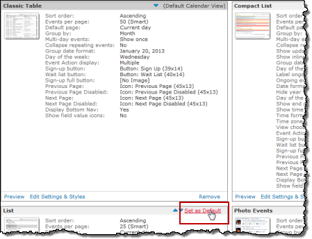
Clicking to set an alternate view as the default
Customize main calendar views
Customizing calendar views means setting the way the main calendar spud looks and behaves on the webpage where it's published.
After you select the views that you want to provide, you can customize:- Main calendar settings that apply to all of your views:
- Calendar list control display.
- Calendar and/or event detail views, separately, on mobile devices.
- How the event actions panel looks.
- Which calendar actions, such as Print and Subscribe, you support.
- How the search results panel looks.
- Each view individually to behave and look the way you want
Main calendar settings that apply to all views
In the Publishing Control Panel, on the Calendar Spuds tab, in the Main Calendar Spud section, click Edit Settings & Styles.
Descriptions of the setting and style choices on the Edit Settings tabs follow. Note that you may see error messages in red for invalid formats.
- General Settings tab
On the General Settings tab, you decide whether or not to:
- Display an embedded calendar list.
- Display the mobile calendar view and/or mobile detail view on mobile devices.
- Enable browser history
- Enable detail view permalinks
Embedded calendar list
The calendar list lets visitors hide or show events based on the calendar the events belong to.
Tip Consider displaying the calendar list only if you mixed other calendars into your calendar during the publishing process. Learn more.

Select Yes to display an embedded calendar list above the calendar.
The following image shows how an embedded calendar list might look.
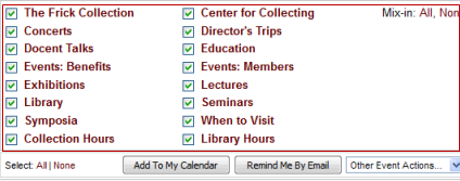
Embedded calendar list (outlined in red)
Even if you choose not to display the embedded calendar list, you can let visitors hide or show events based on calendars. For example, instead of displaying the embedded calendar list, you can add a Calendar List spud and embed it beside the main calendar.
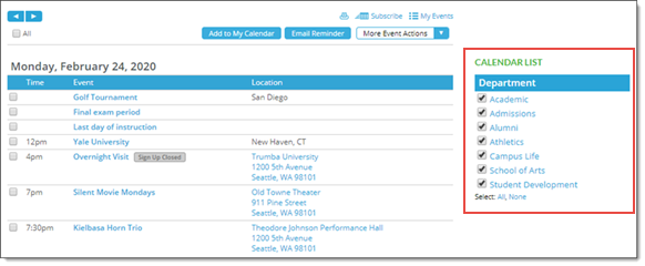
Calendar List spud (outlined in red) beside the main calendar
Learn more about Calendar List spuds in Mixins, paging, and grouping.
Enable mobile calendar view and Enable mobile detail view
You can set the main calendar to display the mobile calendar view and/or the mobile detail view, separately, on mobile devices.
With Enable mobile calendar view set to Yes, calendar visitors using a mobile device see the mobile calendar view.
With Enable mobile detail view set to Yes, calendar visitors using a mobile device see the mobile event detail view.
Both views are optimized for smaller screens.
For more information, go to Optimize the main calendar for display on mobile devices.
- Embedded Calendar List tab
If you decide to embed a calendar list above your calendar, on this tab, you choose style settings that determine how that embedded calendar list will look.
If you set base styles, those styles are reflected in the settings on this tab.
- Event Actions Panel tab
On this tab, you choose the settings that control how the Event Actions panel looks.
Tips
- The Event Actions panel is visible only when you support actions on multiple events. Learn more about hiding event actions in calendar views and setting up event actions.
- If you set base styles, those base settings are reflected in the Styles sections of the Event Actions Panel tab.
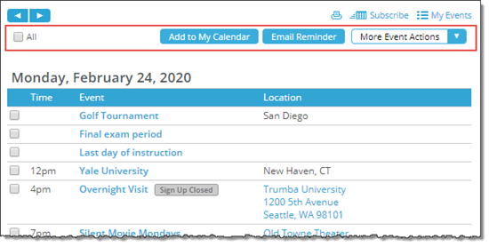
Event actions panel (outlined in red) with custom background and button colors
By default, the Event Actions panel is available at both the top and bottom of your published calendar. If you prefer, you can limit the panel to only one of those two locations.
Using the style settings on the Event Actions Panel tab, you can customize the panel's background color, border color and width, font, text size, and link color. You can also customize background, border, hover, and text colors for the event action buttons.
- Calendar Actions Panel tab
Using calendar actions, visitors can print the current calendar view and subscribe to your calendar to stay informed about upcoming events.
Tell more more about calendar subscriptions.
Visitors can also use the My Events action to open the Event Actions web app where they can view and manage their calendar subscriptions.
On the Calendar Actions Panel tab, in the Settings section, you decide which calendar actions to make available. In the Styles section, you choose styles that control how the calendar actions panel looks.
Tip If you set base styles, those base settings are reflected in the Styles section of the tab.
The default settings in the Settings section look like this:
Select No for actions you prefer to hide.
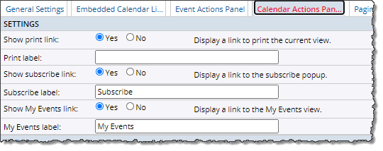
Default settings, Settings section
By default, the Print, Subscribe, and My Events links are visible at the top of each calendar view.
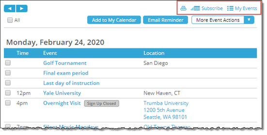
Calendar actions in a published calendar view
Tip Calendar actions you show or hide using the Calendar Actions Panel tab affect all calendar views, with the exception of the Mobile Table view. Mobile Table view has its own calendar action settings.
- Paging Buttons tab
Tip To get to this tab, go to the Publishing Control Panel, Calendar Spuds, and then the Main Calendar Spud section. Under the Main Calendar spud, click Edit Settings & Styles, and then go to the Paging Buttons tab.
In the Settings section, you can choose whether to use Buttons (configured globally on this tab) or Images for the paging button (arrow) controls.
Choosing Buttons allows you to set up global paging buttons, which apply automatically wherever they're displayed.
If you choose Images, you set the images separately in each calendar view you're using, as well as in the Date Finder promotion spud. This may make sense if you'd prefer to use your own custom images (to tailor the button style to the style of each spud). There are no global settings in this case, although a small set of common, built-in images are available in each spud. See: How to use custom images for paging controls.
If you choose Buttons, you can set them up and configure them on this tab, including:
- In the Settings section, whether to show a button when inactive (for example, if there is no previous page), and which arrow characters to display inside the buttons.
- In the Button Styles section, the arrow size and button width, height, separation, and corner rounding.
- In the Active Buttons section, the button background, arrow, and border colors, in both link and hover states:
- :link when the button is active and available on the page.
- :hover when the user hovers over the button with the mouse cursor.
Button background and arrow colors are inherited from base settings: Background color from the Base button background color, and Arrow color from the Base button text color.
IMPORTANT By changing these colors, you are "breaking" this inheritance. That is, if you change these colors, they stay at your new selection regardless of how you may later change the base settings. To "re-inherit" the colors, you can click the up-arrow widget, shown in the screenshot below:

For this reason, unless you specifically want the paging buttons colored differently than other objects on your website, we recommend updating the base settings instead. (Sign-up and event actions panel buttons also inherit the Base button color base settings for link and hover colors; day of the week headings on the Date Finder and month views, and the month heading on date icons, inherit the link colors.) For more information, go to: Spud style settings. - In the Inactive Buttons section, the button and border color and the arrow color for the buttons when they are inactive (for example, if there is no previous page).
- Search Status Panel tab
When a visitor searches your calendar by keyword, date, or location or uses a filter to limit the events the calendar displays, by default, a search results panel appears above the calendar.
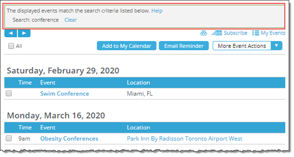
Search results panel (outlined in red). Your calendar's calendar and event actions options may look a little different from the ones shown here.
On the Search Status Panel tab, you can hide the panel if you prefer. However, if you provide search and/or filter spuds next to your main calendar, displaying the panel gives visitors helpful feedback about and an easy way to clear search results.
Where can I learn more about search and filter spuds?
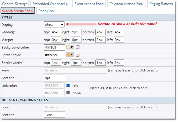
Search Status Panel tab
In the Styles section of the tab, you can choose settings that control how the search results panel looks.
If you set base styles, those styles are reflected here.
- Print View tab
Use this tab to modify the print output generated from your published calendar.
In the Banner Image section, you can select from an existing image on your account using the drop-down arrow (see the screenshot below) or click New to add an external banner image. You can also modify a selected image by clicking Edit. For information, go to How to update and delete images.
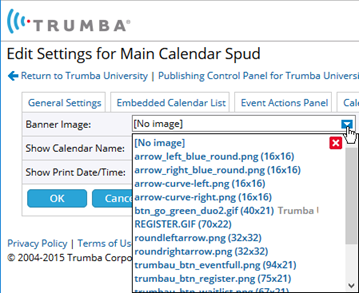
You can toggle Show Calendar Name and Show Print Date/Time to display or hide the calendar name in the header, and/or display or hide the time/date stamp in the footer. You may want to hide the calendar name if it also appears in the banner.
Visitors to your calendar can click the print icon to create a print output that reflects the changes you've set up here:

The screenshot below shows an example of a banner added to the print output from a fictional 25Live University website:

Customize individual calendar views
Each view has two categories of customization:
- Settings that affect calendar behavior
- Local style settings for an individual view
For help with these settings, click the blue Help buttons ( ) where you see them in the settings forms.
To set the behavior and styles of a calendar view
- In the Publishing Control Panel, on the Calendar Spuds tab, under Available Calendar Views, find the view you want to customize.
- At the bottom left of the view description, click Edit Settings & Styles.
- On the Edit Settings page, the tabs you see depend upon the calendar view you're customizing.
- List and Classic Table views: General Settings and Events: Default Layout tabs.
For these views, you find both behavior and style settings on each tab.
Tip These views are unique because you have more options for how events are organized and displayed. For example, you can use these views to feature high visibility events.
- All other views: Behavior and style settings each have their own tabs: Settings and Styles.
- List and Classic Table views: General Settings and Events: Default Layout tabs.
- On each tab, set the options you want.
I need a whole lot more information before I can possibly select my style preferences.
Related information that might help you decide which behavior settings you want:
- Set up event actions
- Mix other calendars into your published calendar
- Organize events on a page (paging and grouping)
- As you experiment with settings, preview them by clicking Preview at the bottom of the forms.
- When you're comfortable with how the calendar view behaves and looks, click OK.
